Young Professionals
Case study
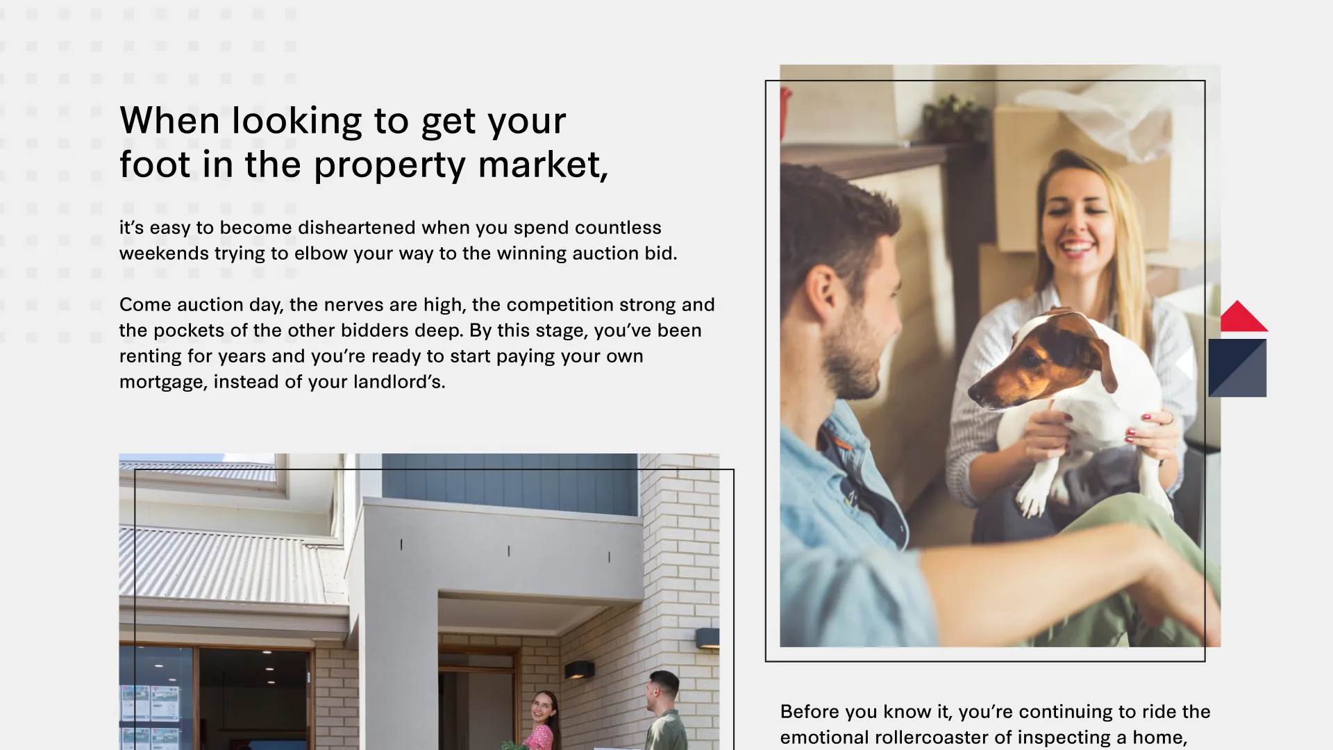
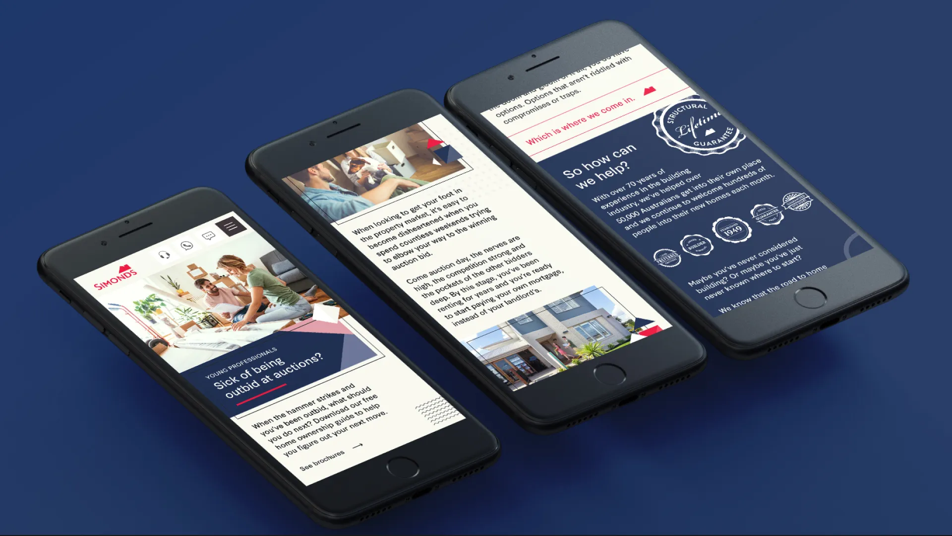
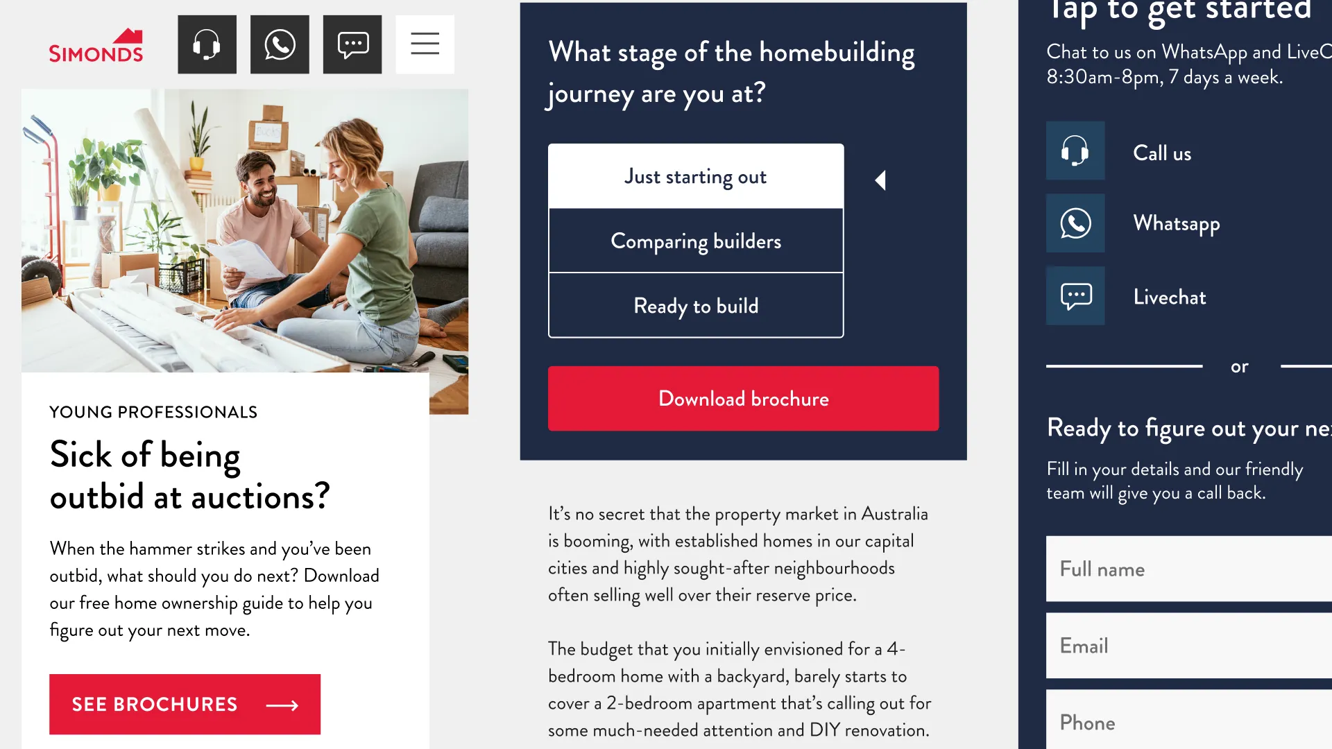
Whilst working at Strange Animals I did a redesign for a campaign called Young Professionals. I spent some of my own free time concepting this design which I felt was more appropriate for a younger target audience.
Wireframes
I commenced the redesign of young professionals with wireframes as usual, designing mobile first with exclusive mobile wireframes.

Grid Layout
When bringing the wireframes into the design phase, I played around with grid and exploded grid in figma

Bespoke Design
I played around with a modern grid system and colour palette whilst maintaining good UX and accessibility.

Final Design
After sending the final designs to the client for sign off, they chose to go with an alternative approach which was on brand and similar to the previous iteration of the design.

Development
Taking the final designs, I commenced building it out into the Simonds Explore website as an extension of the main site. Using tailwindcss and craft cms, I built it out in a rapid sprint.


